The house style of SintLucas
On this page you can find the house style elements of SintLucas including the logo and the explanation of its use, the SintLucas colours, the typography, the grid system and how to use it. Do you have questions about the house style? Then contact the SintLucas Marketing and Communication department at: communicatie@sintlucas.nl.
The logo
There are two versions of the SintLucas logo. The explanation of these two versions can be found below. The “i” in the logo is written with a small letter. This “i” stands for each individual pupil and student of SintLucas. The logo consists of two primary colours. SintLucas orange for ‘Sint’ and black for ‘Lucas’. This creates a clear contrast between the two words, making it easier to read and creating the distinctive look of SintLucas.
SintLucas logo
Creating opportunities
Creating opportunities is the broad translation of our mission and vision. We create opportunities to make future dreams come true. Not only for pupils and students, but also for our staff, companies and other partners. And we expect them to do the same themselves. The SintLucas pay-off ‘Creating Opportunities is used to emphasise the mission and vision of SintLucas. If the logo is smaller than 45 mm, the pay-off is no longer used.
We use the pay-off ‘Creating opportunities’ for all corporate communications. So for all internal communication and for all communication aimed at companies and business relations. In the case of communication towards (potential) pupils and (potential) students, we use the recruitment logo with Vakschool voor creatief talent.
SintLucas logo
Professional school for creative talent
About our identity, we want to be clear. We are a vocational school for creative talent. That is why we use the recruitment logo Vakschool voor creatief talent in all communications to (potential) pupils and (potential) students, unless the logo is smaller than 45 mm. In that case, we omit the pay-off Vakschool voor creatief talent.
The primary logo of the SintLucas recruitment campaign consists of a frame with a bite out of it. This is an important element in the design of the further style of the recruitment campaign. The bite stands for the fact that you are never done learning and there is always room to develop further. Would you like to use the recruitment logo specifically? If so, please contact the Marketing & Communications department at communicatie@sintlucas.nl.
Download logos
Download below the different logos of SintLucas with and without pay-off Creating opportunities in different file formats. Would you like to use the logos for printed matter? Then contact the Marketing & Communications department at communicatie@sintlucas.nl.

SintLucas colours
Primary
SintLucas has distinguished itself for years with its orange colour. It is therefore important that this colour always recurs in SintLucas’ expressions. Whether subtly in the logo or as a pronounced colour field. In addition, black also falls under the primary palette.
Please note: we only use the colour SintLucas Orange Fluor (PMS 811U and 811C for professional printing).
Secondary
In addition to the primary palette, a secondary palette has been developed. After all, SintLucas is a creative vocational school, so we let that come back in colour. The values ‘fun’ and ‘self-confidence’ (yellow), ‘pride’ and ‘individuality’ (purple) and ‘growth’ (green) have been translated into a versatile colour palette that invites us to create dynamic, playful, outspoken and modern expressions, regardless of whether we communicate internally or externally.
Tertiary
The tertiary palette, with the colours white and grey, creates ‘air’ in a layout.

Typography
The font of SintLucas is Pangram – Mori. Arial is the alternative font for documents where Mori cannot be used. For example, online and in Office (Word) documents. Would you like to receive the font Mori or do you have questions about its use? Then send an e-mail to communicatie@sintlucas.nl.
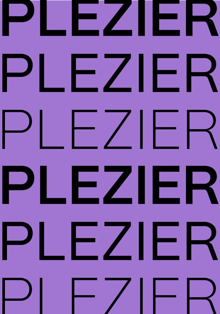
Typographic pattern
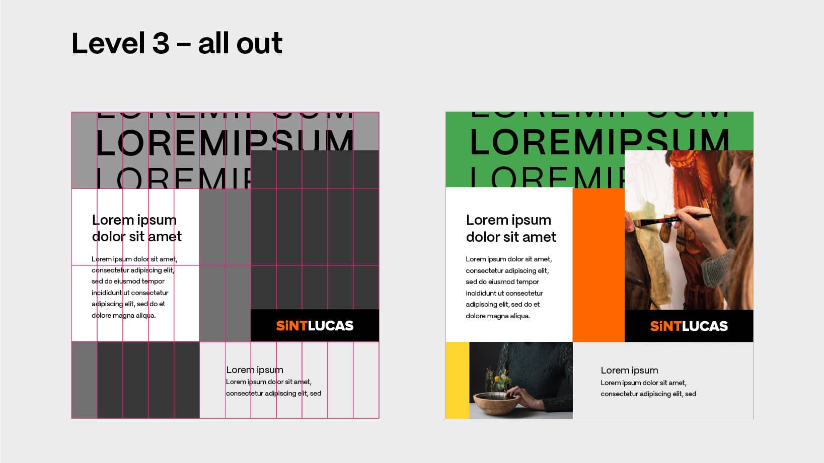
We use a typographic pattern as a design element. We do this with powerful keywords combined with a coloured background from the primary and secondary colour palette.
Use a maximum of one word* in this pattern, using Mori font. This word should be fully legible at least once across the whole page.
Repeat this word at least six times over the height of the entire canvas. This ensures that the pattern is never too big and always legible Provide contrast between words by alternating between semi-bold, regular and extra-light interline.
For this pattern, use keywords ONLY IN CAPITALS and ONLY as black text, unless the background is black, use white.
*’SintLucas’ as a name and/or logo will never be used as a typographic pattern or design element.
Grid system
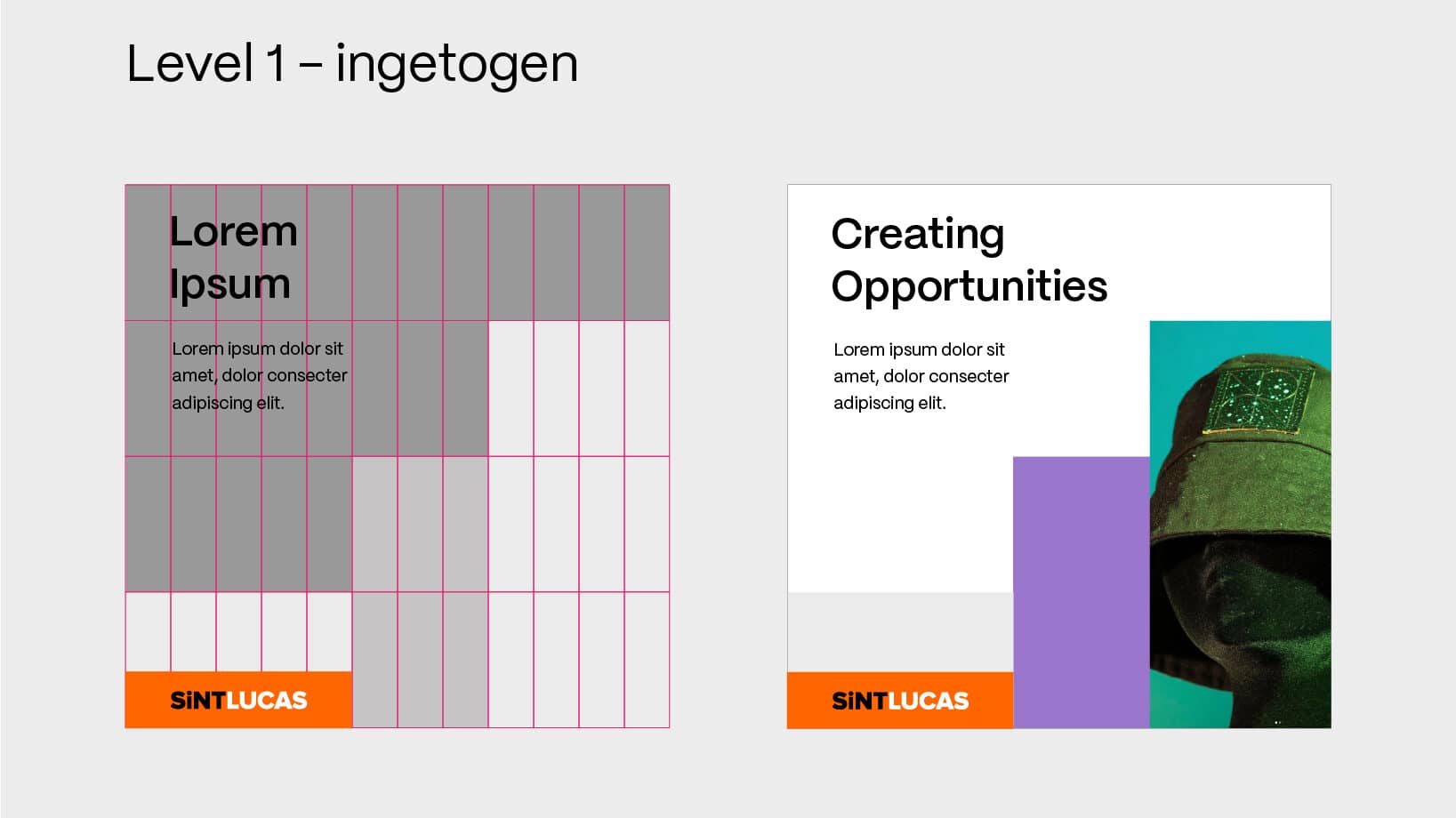
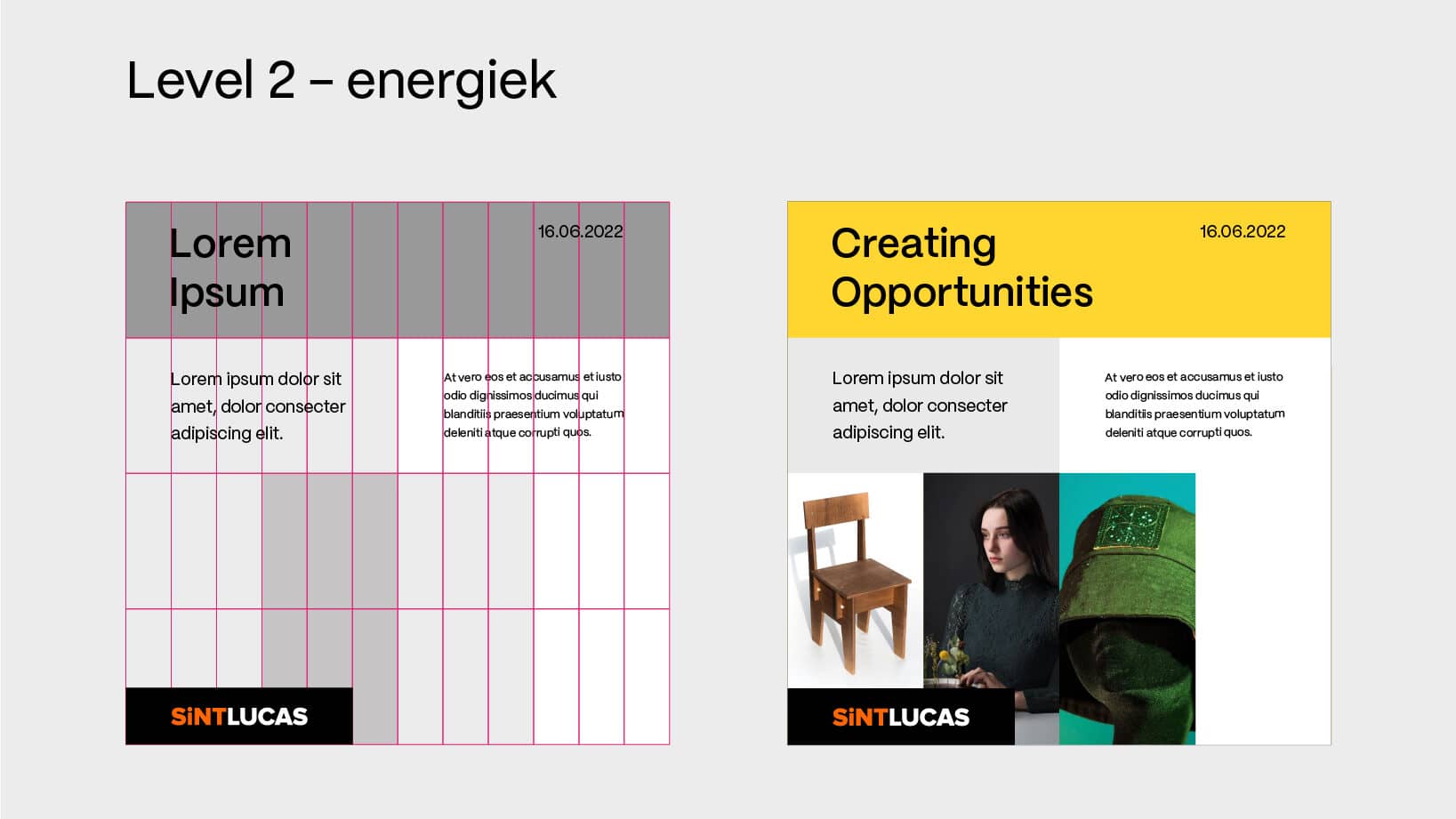
SintLucas facilitates growth. This is reflected in the visual identity this is translated into a grid system. A system within which everyone has space to create. This can be done at different levels: from “subdued” to “all-out” to show more individuality. Applying the grid system in combination with the SintLucas logo, the colours, typography and the image creates a clear line in means.
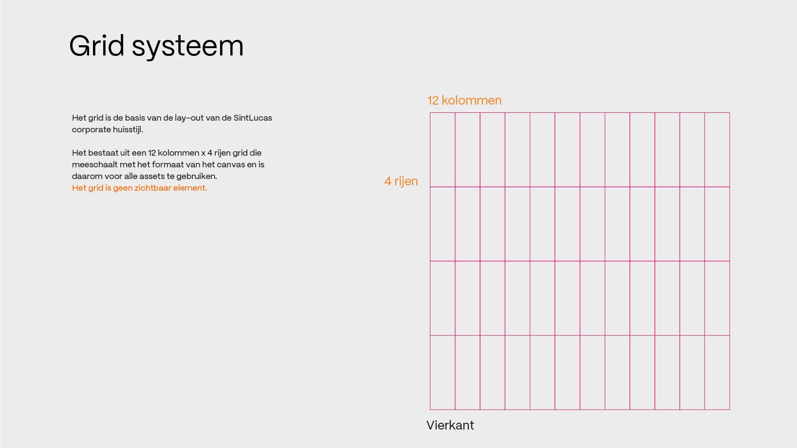
The grid is the basis of the layout of the SintLucas corporate house style. It consists of a 12-column x 4-row grid that scales with the format. The grid itself is not a visible element. In the design of SintLucas’ corporate house style, we use three levels of intensity: ‘subdued’, ‘energetic’ and ‘all out’. The use of the three levels creates a separation between informal and business means without losing the unity in the SintLucas design.
